PROCESS
This project included working both with a team and individually. As a team, we conducted research on the cultured meat industry and composed a brand audit of the parent brand New Age Eats. We also grew a Mycelium mushroom tray to determine our final packaging’s dimensions. Individually, I composed the brand identity for the sub-brand Betterwurst and designed its packaging.
RESEARCH
To begin, my team and I researched the parent brand, New Age Eats. We made a moodboard to compile their use of color, typography, photographic treatment, graphic elements, and tone. We also conducted a market analysis of several other brands within the cultured meat industry. This information was organized into themes and patterns in order to gain insight into the overall design choices in this new field.
PARENT BRAND MOODBOARD
MARKET ANALYSIS
SUSTAINABLE PACKAGING
Because cultured meat is on the new frontier of sustainable food sourcing, it was important to utilize eco-friendly packaging for this project. We created our own Mycelium mushroom trays that determined our final packaging’s dimensions. Our trays were constructed using Ecovative, a company that provides Mycelium mushroom technology to grow and build custom compostable products. This process involved our team mixing the mushroom ingredients with flour to begin the growth process, sealing it for a week for the mushrooms to sprout, filling the mixture into a tray for our product to be placed in, and then curing the final tray with oven heat. Once it was complete, we measured the tray to then build our packaging dielines individually.
CONCEPT
Because this product was geared towards Baby Boomers, I decided to use inspiration from local butcheries for my concept because I wanted to reference an experience this demographic would be familiar with. I centered the theme around the parent brand’s use of big, chunky typography because this also aligned with what I found in butcher shop designs. I chose a limited color palette to reference a simple and straightforward aesthetic and incorporated aspects of parchment paper and stamps to represent quality and certification.
WORDMARK
This wordmark utilizes the parent brand’s bold and big typeface. I combined this with an additional typeface for the flavor and subhead to provide contrast with its thin line weight. I then created a stamp to be placed on top of the word mark, featuring the parent brand’s name and graphic of their pig. The stamp implies quality and a seal of approval that customers associate with trust.
FINAL WORDMARK
SKETCHES & IDEATION
COMPOSITION
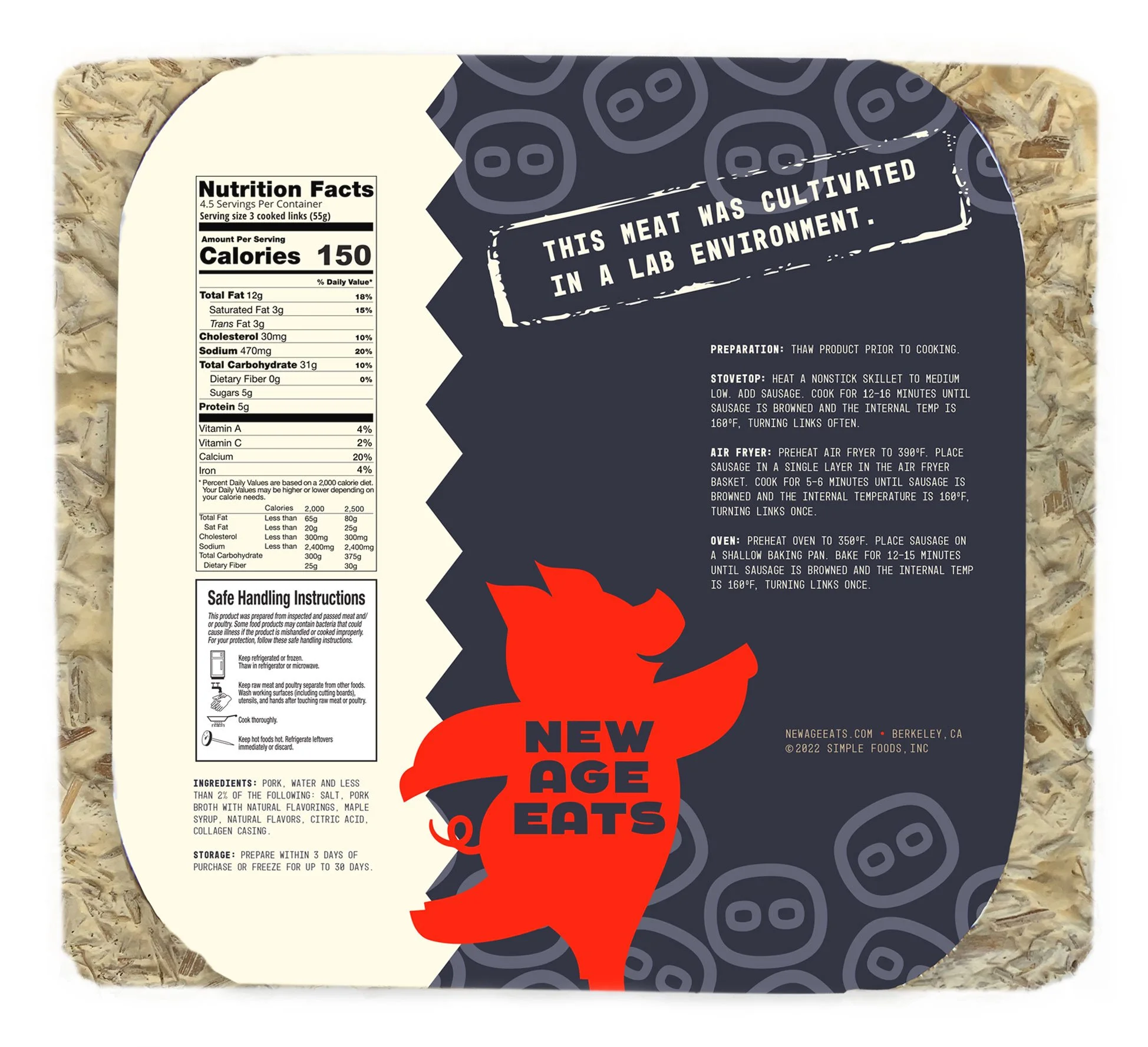
For the layout, I used New Age Eat’s graphic of their pig as a cut-out on top of the package to view the sausage because cultured meat is such a new concept and the target audience wants to know what it looks like. I incorporated a seamless zig-zag around the packaging to reference the edge of a sheet of butcher parchment paper and exaggerated its scale to complement the cartoon nature of the parent brand’s tone. I created a pattern using New Age Eats’s graphic of a pig snout and used it as a background texture to playfully tie this product back to its parent brand. I created an additional stamp for the back to imply certification while educating the consumer about cultured meat. New Age Eat’s logo is repeated on the back, which points to the cooking instructions for easy navigation.
FINAL PACKAGING
SKETCHES & IDEATION
REFLECTION
Creating this Betterwurst packaging taught me about designing sub-brands within an established brand and how to expand its reach while adhering to the parent brand’s tone. Both New Age Eats and the cultured meat industry are so innovative and experimental in their voice, however, the target audience for this project prefers traditional representation in their purchases. This provided a unique challenge and my final design merges these two dynamics by being playful in its tone while referencing a design style Baby Boomers are comfortable with.


